Introduction
The Search Results section controls the values users see after the application executes a search. It also determines the interaction possible with those values.
This process demonstrates specific configuration choices you can make with the Search Results section.
Prerequisites
- The form you need to edit must already exist.
- Any picklist value pairings you are going to use must exist in the Code ID framework table and must be configured in the table columns.
- Any CSS classes you are going to use must exist in the Style tab of the respective lookup form.
|
Quick Steps |
| 1 |
Select the Search Results section |
| 2 |
Open the section properties, if desired |
| 3 |
Update the section properties, if desired |
| 4 |
Add buttons, if desired |
| 5 |
Open the button properties, if desired |
| 6 |
Update the button properties, if desired |
| 7 |
Delete buttons, if desired |
| 8 |
Add fields to the results data table, if desired |
| 9 |
Edit fields, if desired |
| 10 |
Delete fields, if desired |
| 11 |
Move fields, if desired |
| 12 |
Change the field control, if desired |
| 13 |
Open the field properties, if desired |
| 14 |
Edit the field properties, if desired |
| 15 |
Open Data Table properties, if desired |
| 16 |
Edit Data Table properties, if desired |
| 17 |
Open the column properties, if desired |
| 18 |
Open the footer details, if desired |
| 19 |
Enter the footer details, click OK |
| 20 |
Save the form |
Detailed Steps
Step 1. Select the Search Results section.
Step 2. Open the section properties, if desired.
The right panel contains the Entity, Properties, and Style Editor tabs.
Step 3. Update the section properties, if desired.
Open the section's Properties tab on the right panel. This enables you to edit custom properties for this section.
Step 4. Add buttons, if desired.
If you add a button to the Search Results section, it usually goes in the top row over the data table.
The button types are:

Button: This is a command button.
Link button: This is a hyperlink style button.
Image button: This is a button that displays an image.
Step 5. Open the button properties, if desired.
Step 6. Update the button properties, if desired.
These properties control the appearance and behavior of the button. Data table buttons often require a related control on the data table. Any button that opens a form requires at least one active form, plus navigation parameters, to identify the record to open. In Xelence, these values default to the paired maintenance screen and the table's primary key (if necessary). You can edit them if the button should use some other values.
Step 7. Delete buttons, if desired.
Step 8. Add fields to the Results data table, if desired.
This adds values to the search results for the user's view. To add columns, right click the data table and click Add Columns.
After adding the column you can change the control type, if desired. Here, we are adding CommunicationPreference as a label in the data table. Click OK.
The column, CommunicationPreference is added as a label.
Step 9. Edit fields, if desired.
Important properties for labels are:
- Related Control: Button whose method executes when the user clicks the control if the control is linkable.
- Entity Field: Attribute the label's value comes from.
The important property for template fields (or columns) is:
- Visible: Controls whether the user can see the field.
Step 10. Delete fields, if desired.
The column will no longer be in the data table.
Tip: Right click the column and select Delete.
Step 11. Move fields, if desired.
To move a field, right click it and click Move Column Left/Move Column Right.
Tip: Try to keep the data table order roughly the same as the Criteria section order.
The columns have been moved.
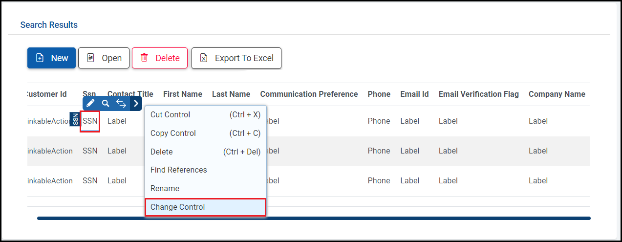
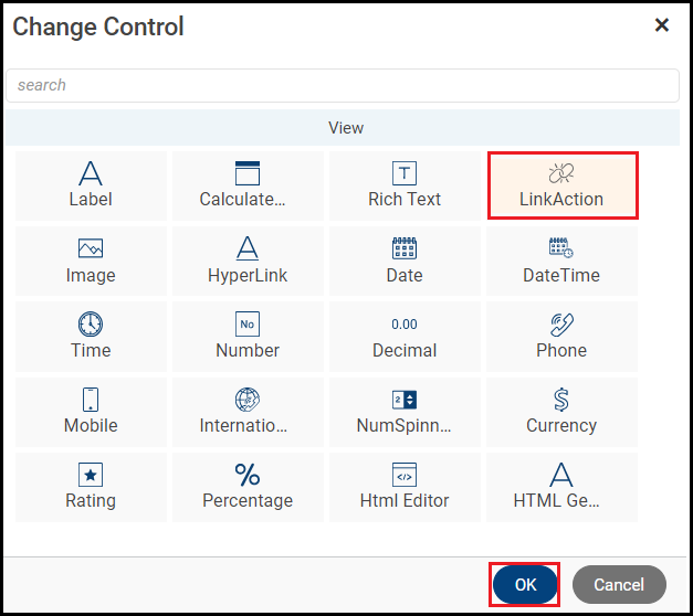
Step 12. Change the field control, if desired.
Right click the SSN label and click Change Control.

Select the LinkAction control and click OK.

Step 13. Open the field properties, if desired.
Step 14. Edit the field properties, if desired.
Properties can be for the field control or the header text.
In the General section, set the Related Control to the Open button. Whenever the linkable SSN is clicked, it will execute actOpen's method and navigate to actOpen's active form.
You can edit major control properties in the Properties tab. To edit properties for the Data Table control, select the label and open its properties.
An example of properties for a Data Table control.
Select the Company Name field and open its properties. In the General section, enter the Display Length as 11. Now when you hover on the record which has company name longer than 11 characters, it displays it as a tooltip.
Open the Customer Id LinkableAction properties.
The Customer Id(Primary Key) has been changed to invisible.
Open the Communication Preference template field properties.
Cell Format is a column property. Click the Cell Format icon to open the window to enter the settings.
Enter the value you want the application to check for when highlighting and the name of the class you want it to use. The class comes from the Style tab and has to be defined there first.
Click OK to save the cell formatting.
Step 15. Open Data Table properties, if desired.
Step 16. Edit Data Table properties, if desired.
This changes the overall data table behavior.
Open the Advance section. The page size is set as 20.
To highlight a whole row, open the row format settings.
Enter the column you want the application to check and the value you want the application to check for. Enter the class to use when highlighting.
Click OK to save the row formatting and return to the form.
Step 17. Open the column properties, if desired.
Click the Ssn template field to open its properties.
Step 18. Open the footer details, if desired.
This opens a window to configure a footer for the column.
Step 19. Enter the footer details, click OK.
Enter the footer properties:
- Footer Type: You can select the footer operation.
- Footer Text: Text of the footer. It displays in the column's footer area.
You can select more than one footer type:

Sum: Sum of all values in the column.
Min: Minimum value in the column.
Max: Maximum value in the column.
Count: Total number of search results.
Avg: Average of all values in the column.
Static Text: Text of the footer.
Step 20. Save the form.
Then, run the Preview. Xelence displays the form output. You can test your updated settings.
When you have previewed your form, it should look something like this.
What are the improvements over S3 Version 6?
This process is nearly identical. However, earlier the CSS class had to be defined in Visual Studio in the common.css file. But, now, it is added in the lookup form itself in the Style tab. This reduces the dependability on the coding platform.
This post is part of the Lookup Form topic. Click here to open the Lookup Form Overview.
#Forms
#Xelence