Introduction
If the user wants to modify the data from the attributes of the main entity or the one-to-one relationship entity, then you have to put controls on the form to modify that information.
Prerequisites
The maintenance form must already exist.
|
Quick Steps |
| 1 |
Update the section properties |
| 2 |
Edit the table |
| 3 |
Add any containers and edit the table(s) |
| 4 |
Add field controls |
| 5 |
Update the control properties |
| 6 |
Move the controls |
| 7 |
Save the form |
Detailed Steps
Step 1. Update the section properties.
Open the section's Properties tab on the right panel. This enables you to edit custom properties for the panel.
Maintenance forms don't usually keep the default ID and section name. You can directly change the caption by clicking on the section header.
The caption shows up in the title bar right away.
Step 2. Edit the table.
The controls will be placed in the table. Its layout is important.
If your section is going to contain tabs or a data table, usually you want to delete all but one cell.
Step 3. Add any containers and edit the table(s).
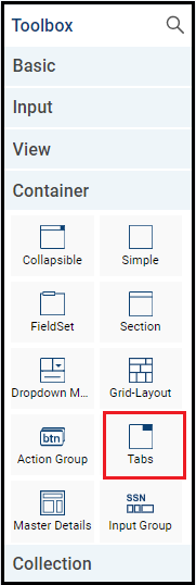
This example adds a tabs control. A tabs control is a collection of multiple tabsheets where you can put controls on each tab. Only one tabsheet is visible at a time.
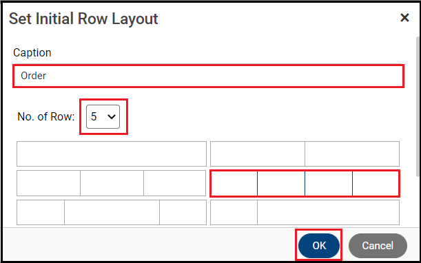
You can change the caption or select the number of rows and column layout for a tab. The tab ID automatically updates as you update the caption name.

Change the dimensions of the table if you know you will be adding more or fewer controls than the default table can attractively display.

To add more tabs, you can right click a tab and click Add New Tab. You can add as many tabs as you want. This example form uses three tabs.
The Order tab's ID gets updated. Maintenance form tab properties are identical to lookup form tab properties.
The Customer Details tab’s ID gets updated.
Step 5. Update the control properties.
The controls are usable after being added, but you can configure them. The control changes appearance or behavior.
Edit the Caption to change how the field displays to users: e.g., "Shipname" to "Ship Name."
To change a control type, click the double arrow icon or use the right click menu.
Ship Country and Ship State have been changed from drop down to cascading drop down. For the parent control Ship Country, make sure the PickList value is configured. The PickList value comes from the entity, but you can override it at the form level in the Data Source properties.
Cascading drop downs filter related data so the user only selects from relevant options. For example, if they select "Canada" as the country, the state drop down will only contain
Canadian provinces.
The Picklist value comes from the entity. If you want to configure a different Picklist value at form level, you can enter the Picklist value in Data Source properties. The form Picklist value overrides the entity Picklist value.
The child control, Ship State, needs its Entity Field and Parent control entered.
Click the Data Source icon to configure the parameters.
The PickList comes from the entity. Click the magnifying glass icon to enter the parameter details.
Select and enter the control that contains the data of the Parameter Field you're using in this PickList's value records.
Parameter value added. Click OK.
It populates in the field. Click OK.
Step 6. Move the controls.
You should organize the controls for ease of use.
All the controls are moved to their desired locations. To move any control, select the control and its data type tag and drag it to the desired location.
The controls have been added to the Customer Details tab. The controls for Country and State dropdown have been changed to cascading drop down. The controls have been moved. None of them required editing. Empty rows are deleted.
Similarly, the controls have been added to the Employee Details tab.
Step 7. Save the form.
Then, run the Preview. Xelence displays the form output. You can test your updated settings.
When you have previewed your form, it should look something like this:
What are the improvements over S3 Version 6?
- Previously, when a Maintenance form was created, it used to create a default collapsible panel in the form. Now by default, it creates a section in the form.
- You can directly update the caption headings in the form and the styles applied are visible in Xelence form itself. Also, various form layout options are available.
Related Articles
Configure the Child Collapsible Control
Add a Cascading Drop Down
This post is part of the Maintenance Form topic. Click here to open the Maintenance Form Overview.
#Xelence
#Forms